Data Engineering with dbt Core
Background Previously, I watched and blogged a...

This article is originally published in this link at Medium.com. I updated it here in order to include the dataset used.
Having read a lot of tutorials on Pandas data visualization, I still can’t grasp the mechanics of it. Creating even a simple plot always requires me to look into the documentation.
And even after running the code and getting the plot right, it doesn’t make me confident to try it on my own. Perhaps, I’m looking for the familiarity of Excel. The connection between the plot and data just seems to be intuitive using the GUI.
With that in mind, can I somehow bring this to Pandas?
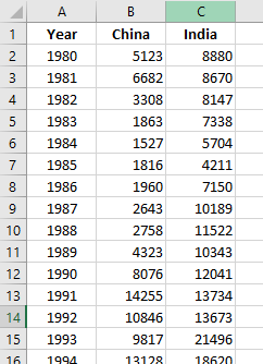
Consider the following data on the number of immigrants from China and India to Canada from 1980 to 2013 (Note: This data is taken from Kaggle.com. The original dataset contains records from 195 countries.)
Plotting this data on a line chart in Excel results to
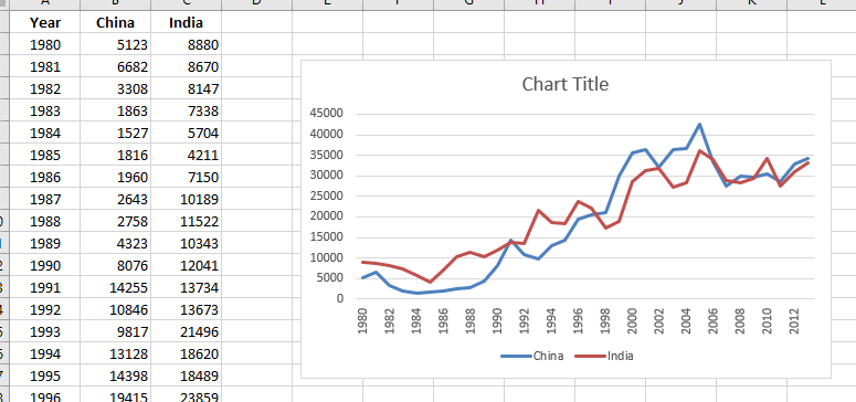
Alright. Nice and easy.
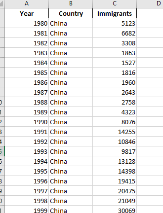
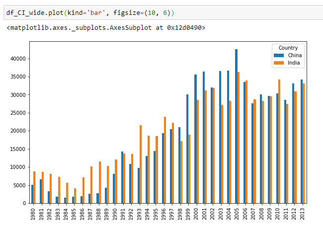
How about the same data but China and India columns unpivoted to create a single Country column?
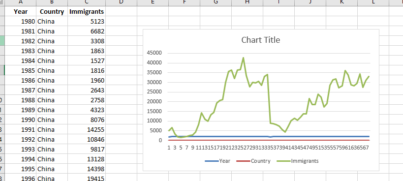
Ok. That’s a mess.
How about in Pandas? Let’s plot the first dataframe

Ok. That works.
Let’s also plot the second dataframe.
Both the Excel and Pandas showed the same plot for both dataframes.
It seems Excel and Pandas render plot the same way! I’m on to something.
The data we have dealt a while ago are the wide-form and long-form data respectively.
The difference between the two forms are:
And this was my aha! moment.
The wide-form has worked well with line chart because I’m basically plotting an independent variable (year) against its metadata (the India and China series).
Now, will this line of thinking work? Let’s found out.
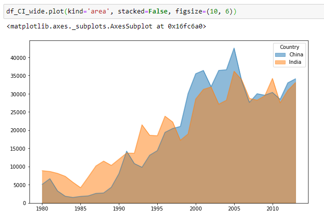
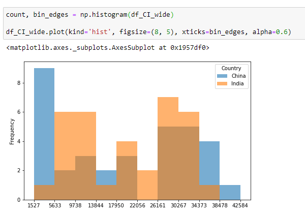
Now, let’s try to create different plots for our wide-form data to test my hypothesis.
Bar Chart
Area Chart
Box Plot

Histogram
Scatter Plot
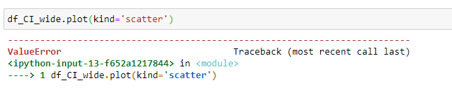
Unfortunately, the scatter plot resulted in an error.
So looking back to the previous plots, it’s now making sense.
If you’re plotting multiple Series against an independent variable, then you use the wide-form. Otherwise, use the long-form.
In other words, the scatter plot is essentially a single chart plotting the number of immigrants on each year. The other charts like bar chart, line chart, etc are essentially multiple charts stacked on one another.
Let’s do again the scatter plot using long-form data and differentiate the dots by country.
Scatter Plot
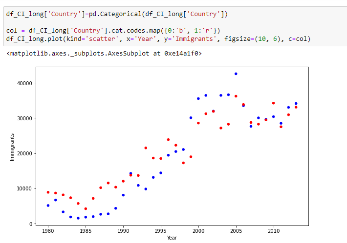
Hooray! That works.
I chose to limit the plotting discussed here to the DataFrame’s plot method.
When you’re new to Pandas coming From Excel, you want to evaluate quickly if you can reproduce the usual charts that you’re using in Excel to be confident using te new tool.
Besides, effective data analysis hinges with fast creation of plots; plot this, manipulate data, plot again, and so on. Hence, you’re going to be bogged down if you try to incorporate different plotting methods here.
Take this as Pareto principle as applied to visualization — you only need to know 20% of the plotting techniques to be productive.
In summary, data in wide-form works well when you’re comparing or plotting multiple Series against the same index. Otherwise, it’s better to stick with the long-form.
The workflow here is that you need to get the data first in the right form and change it until you get the desired plot.
Only then you could design or add elements to the plot to make it more appealing.
This is similar to Excel when doing data visualization. You have to get the right data first for Excel to give the right chart. Then you change chart elements, add title, etc. to more it more effective.
Rather than reading a lot of tutorials on Pandas data visualization, having a mental model of how the data corresponds to the plot makes data visualization more fun.
Background Previously, I watched and blogged a...
This article is originally published in this...
This article is originally published in this...
Background As I’m looking for ways to learn mo...